Our living room is huge, both in square feet and height. It's one of the things we liked most about our house when buying it. We knew that one big living room was much more in line with our lifestyle than two smaller living spaces (a formal living room and smaller den/family room that some houses have). And it's a two-story room which makes it feel really open and connected to the loft upstairs.
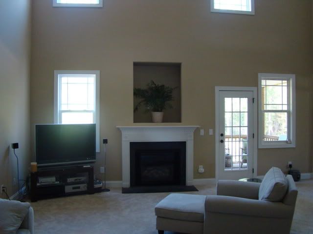
But I had no idea what a challenge it would be to furnish and decorate a room this big. I know, I know, talk about first world problems, huh? Complaining that a room is too big? Anyway, let me show you some befores.
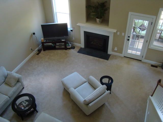
View of the living room looking down from the stairs/loft:
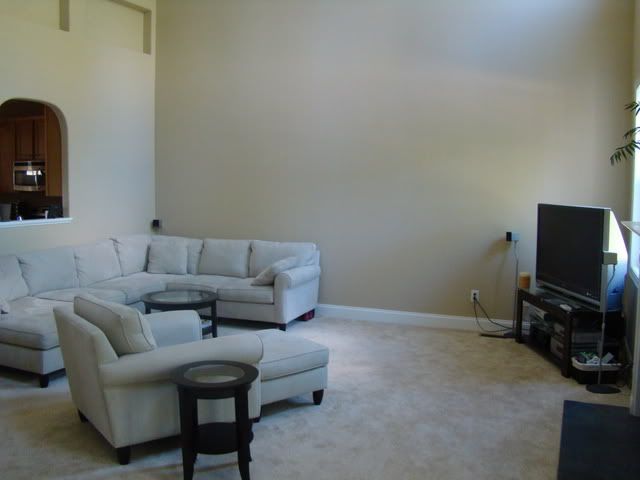
View from the kitchen/hallway:
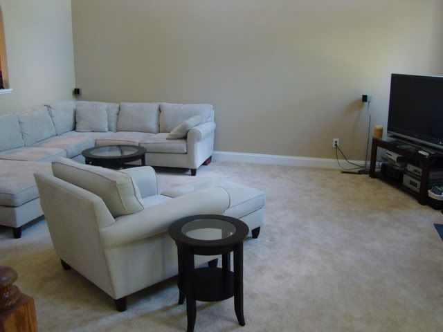
View from our bedroom:
As you can see, our main furniture is already in place in the befores. One of the first things we did after moving in was order the couch (the TV and stand came from Lee's apartment). We knew we needed a sectional to fill the space, but ended up spending hours and hours deciding on the perfect configuration. I fought hard for the chaise lounge on the left side (you can't see it that well in this picture) and it's ended up being the spot on the couch we use 99% of the time (so of course, I was right).
However, going with the chaise option created another challenge -- the coffee table. Because the chaise created a small square area we weren't able to use a regular rectangular coffee table, and most square ones were too big. We finally found a suitable dark wood and glass round one on Target.com and ordered the end tables to match.
For the first 9 months, we had an old Target chair and ottoman in the room, but were finally able to upgrade it. We decided to order the matching chair and ottoman from the same set our sectional came from. Looking back on it now, I wish we'd gone with something different, since it's too matchy-matchy for me now. Ideally, we'd get the Manhattan leather recliner from Pottery Barn, but we've got a lot invested in the current chair and ottoman, so I can't justify making the switch right now.
So as you can see, we had a lot of nice furniture but the room was totally B-O-R-I-N-G with a capital B. And talk about beige. Builder beige walls (with the high ceiling and the room being open to the upstairs and loft, painting was NOT a possibility), beige carpet, beige furniture. It all sort of melted together. Bleh.
But our main source of frustration? This monster of a wall:
This baby is two stories high (I wasn't even able to get a picture of the WHOLE wall) and utterly, completely BLANK. The other three walls of the room all have some sort of architectural interest. Windows, fireplace and door on one, stairs and door to our bedroom on the other, and hallway and cutout window to the kitchen on the third (not to mention these weird little recessed boxes at the top of the wall -- you can sort of see them in the pic above).
But this wall? Nary a visual interruption in sight. What were we going to to with such a big blank canvas? Buying even the biggest piece of art, slapping it on the wall and calling it a day was not going to cut it.
We thought about buying a big tall bookcase to break up the space a bit (and then we could add art/pictures just over the couch portion of the wall). But we couldn't find anything we loved that wouldn't still look dwarfed on that wall. We also thought about buying a big entertainment center to go on the wall and repositioning the couch and chair, but we just couldn't make that configuration work.
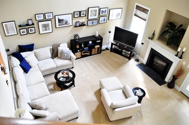
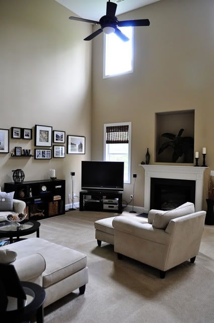
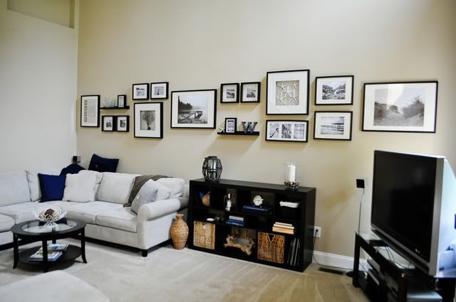
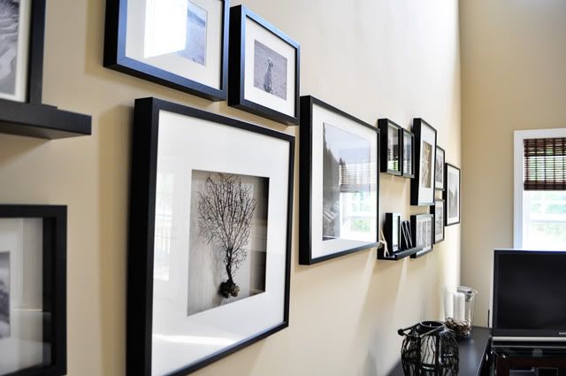
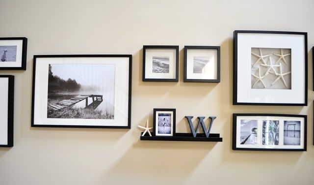
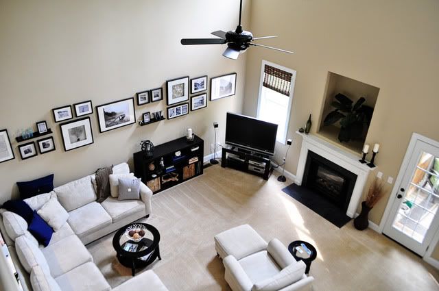
We finally ended up going with a short bookcase to fill the gap between the couch and TV and a gallery wall of frames that stretches across the wall. I also decided on a nautical/beach inspired feel with a navy and gray color palette.
So, now for some afters.
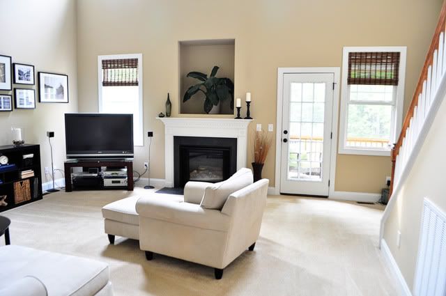
One of the first things I did was add the bamboo shades. Another challenge of this room is that it's not conducive to curtains. On the fireplace wall there are four windows (two wayyy up high and two down low) and the door to the back porch. Because of one of the windows is right next to the door, curtains weren't really an option.
But because we're in the corner lot of a cul-de-sac and our lot backs up to woods, privacy isn't really an issue. No one can see into our living room windows unless they're in OUR yard, which they shouldn't be. So blinds weren't really necessary here but I wanted to add the roman shades to make the room look more homey and finished. I only added them to the ground floor windows, because blinds on windows that high are just weird, right? (Not to mention, how in the world I would have gotten them hung up there?)
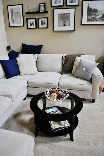
Next up was adding the navy and gray pillows and throws to the couch and adding some accessories to the coffee table, end tables and mantle.
Then I took a year-long break while we hemmed and hawed over what to do with that wall. We finally bit the bullet and made a marathon excursion to Ikea for the bookcase and frames.
Cut to another year later for me to actually get pictures in all of the frames and accumulate enough accessories to "style" the bookcase. And that's how we ended up with where we're at today.
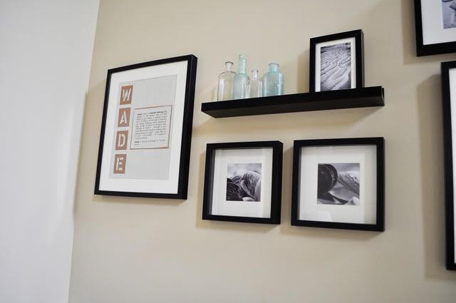
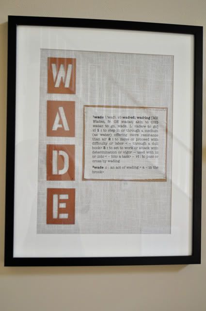
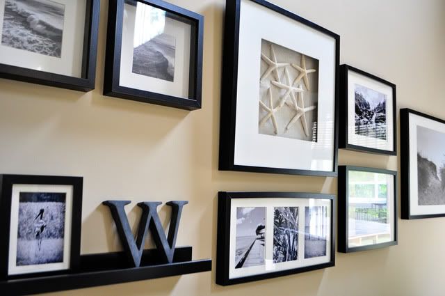
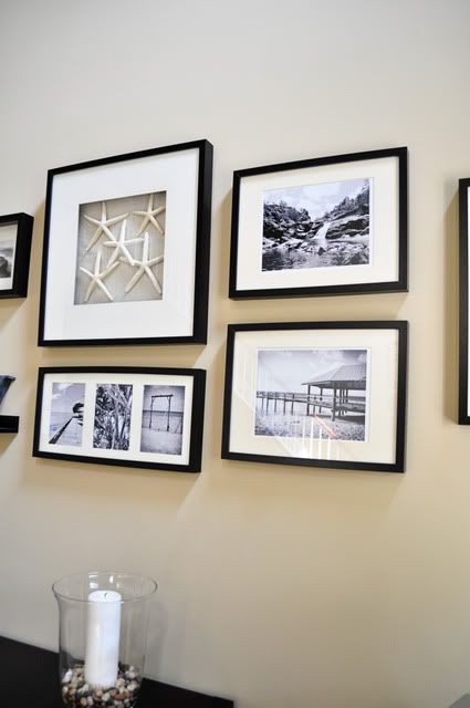
As for the frames, the two large pictures (sand dunes and pond) and the small clam pictures were prints from Ikea. The rest of the images were Sugar-on-the-beach pictures and pics from our Australia trip. Then I matted the square shadow box frames with linen fabric and framed the starfish (from our wedding) and sea fan (purchased on eBay). I knew I wanted to do something with the definition of our last name, since "wade" is an actual word found in the dictionary. So I typed up the definition, printed it straight onto the linen fabric and paired it with stencil letters spelling out Wade.
As always, there's still a list of things I'm not totally happy with:
- The sad plant in the niche above the fireplace. Obviously that niche was a poor design choice on the part of the builder given the size and shape of TVs these days. WHY are they still putting those things in houses? Anyway, maybe I'll get clever and do something cool there. For now, a plant to fill the space (and pretty poinsettias at Christmas).
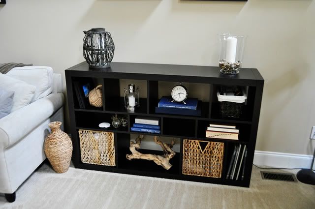
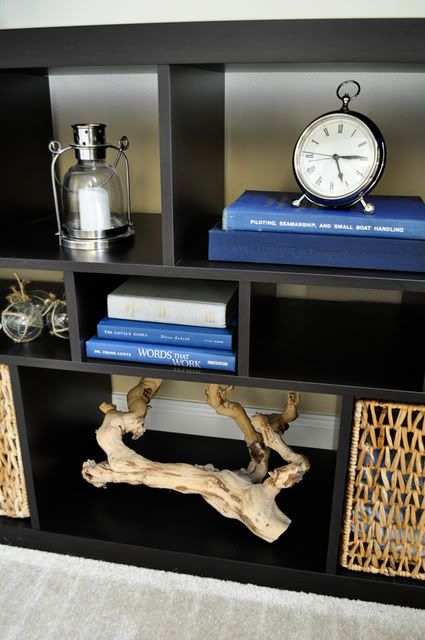
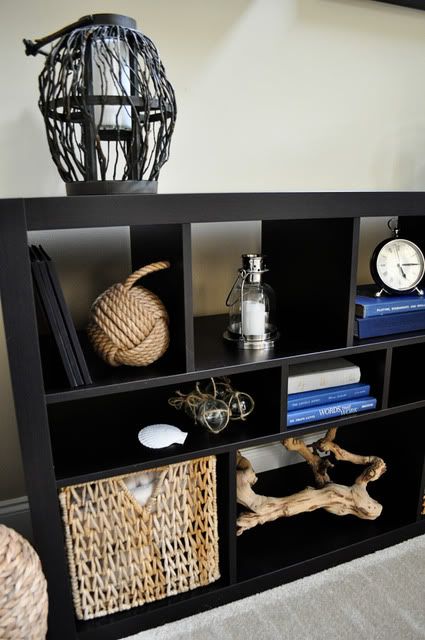
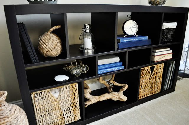
- The bookcase. Some of the "cubbies" are empty. I'm not totally happy with how it's stylized. But it's the type of thing that will evolve and take time. You can't really set your mind to go out and buy something to fill the space. You need to come across the items and add them over time.
- I already told you my thoughts on the chair. And my longing for this one.
But for the most part, we love our living room. It's pretty. It's functional. It's us.
Finally, here's a list of sources, if you're interested:
- Couch, chair and ottoman: Haverty's
- Coffee and end tables: Target.com
- Pillows: Pottery Barn, Target and Ikea
- Throws: Pottery Barn and Ikea
- Bamboo shades: Overstock.com
- Vases on mantle: Ikea
- Candlesticks on mantle: AC Moore
- Bookcase: Ikea
- Rustic wood lantern: Homegoods
- Hurricane vase and pebbles: Ikea
- Rope knot doorstop: WhateverWorks.com
- Small silver lantern: Pottery Barn
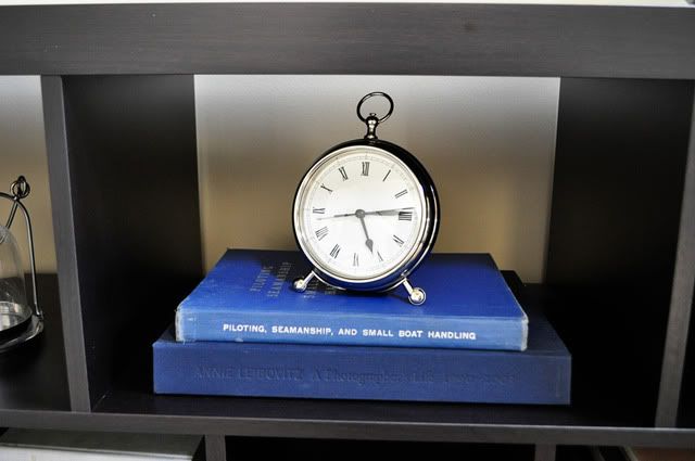
- Silver pocketwatch clock: Pottery Barn
- Books: already owned and used book store (I was looking for navy and gray-bound books and was able to find some nautical themed ones as a bonus)
- Driftwood: Homegoods
- Baskets: Ikea
- Glass fisherman's floats: Pottery Barn
- Frames and shelves: Ikea
- Vintage glass medicine bottles: flea market
- Cast metal "W": Restoration Hardware



I love your gallery wall. It's the perfect use of the huge space! I also love the bookshelf and that it's not completely filled in. I've actually been wanting one for our master bedroom. Thanks for sharing this!!
ReplyDeleteNeutral but really nice!! Love it
ReplyDelete