Friday, May 27, 2011

Pinwheel Baby Shower

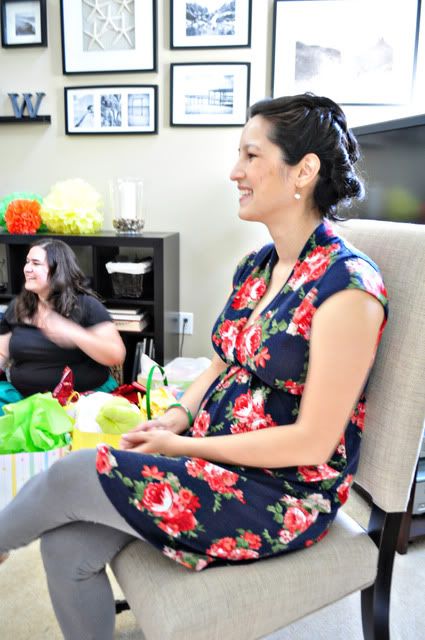
I'm finally getting around to telling you about the baby shower I hosted last month for my coworker Melissa.

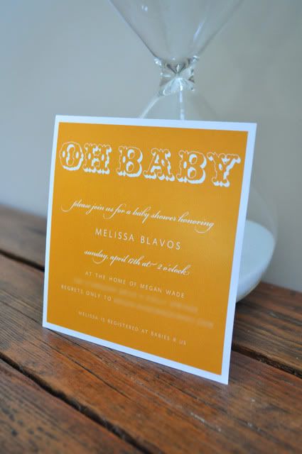
She's having a girl, but we (we being my coworker Carmen and I, who helped plan the shower) wanted to go with bright gender-neutral colors, instead of a baby pink affair. I started with a simple orange invitation, and we settled on a color scheme of orange, yellow, blue and green.

Photobucket

(Invite from etsy seller mink cards)

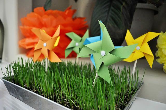
Inspired by a baby shower on Hostess with the Mostess, I went with a pinwheel theme, and also added in some tissue paper pom poms. I made the pinwheels myself -- about 16 large and 20 small -- using these instructions. The tissue poms were made using Martha's tried and true method.

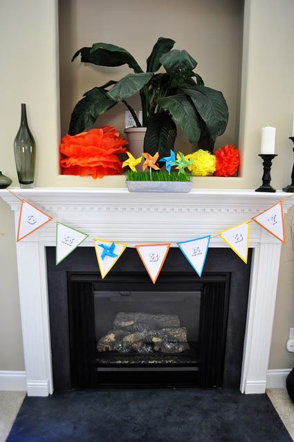
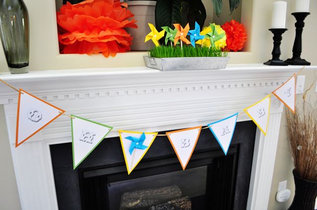
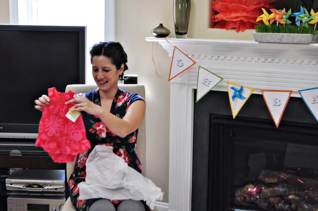
For the mantle, I DIY'ed a pennant banner and a bed of wheatgrass with pinwheels.

Photobucket

Growing wheatgrass in galvanized containers is still my go-to party trick. As long as you time the planting right (about 7 days ahead of your party), it's super easy. I buy my wheatgrass seeds from Whole Foods (located with the other herb/flower seed packets).

Photobucket

Photobucket

Photobucket

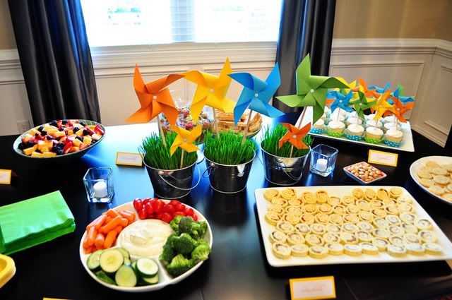
The food table included more wheatgrass and pinwheels. I also hung poms from the ceiling above the table but forgot to get a picture (gah!!).

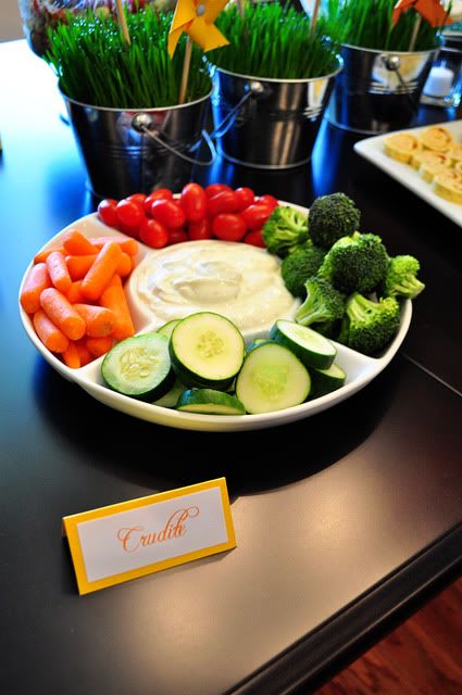
Carmen took charge of the food and we had delicious tomato bruschetta, homemade parmesan and thyme crackers, pinwheel (get it?!) sandwiches, vegetable crudite, fruit salad and cupcakes. Being the anal retentive person that I am, I made little labels for each item.
Photobucket

Photobucket

Photobucket

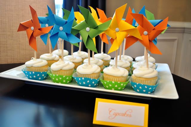
Would you have ever guessed that these cupcakes came from Wal-Mart? No, they are not $2 a piece cupcakes from a fancy bakery. They are $6/dozen cupcakes from Wal-Mart with plain yellow cake and white icing that I fancied up with cupcake liners and pinwheels. (I did specify when I ordered them that I wanted them iced with a round icing tip and not a star tip, because I thought they'd look less grocery-store-esque that way. Again with the anal retentiveness.) And by the way, they tasted delicious!

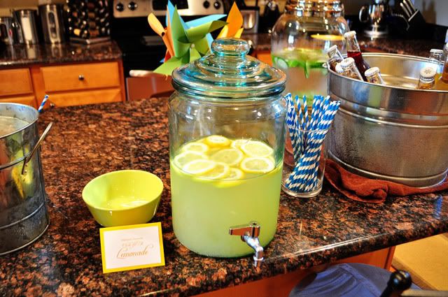
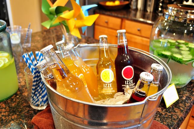
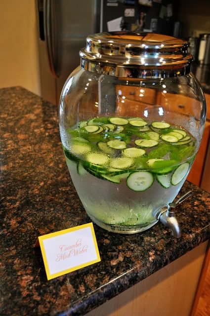
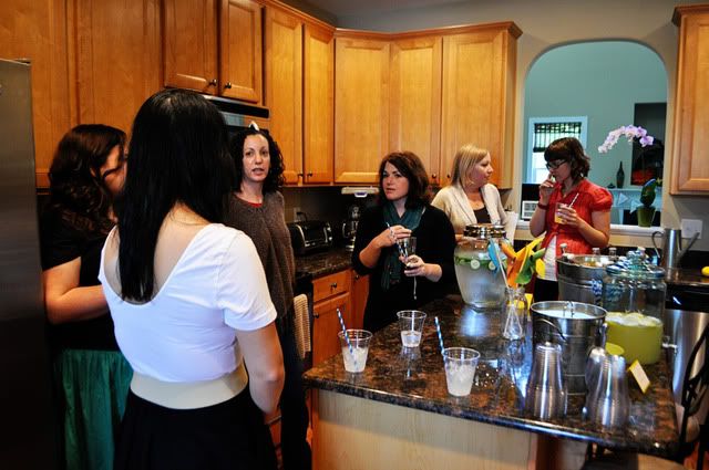
As for beverages, we served "Melissa's favorite Chic-fil-A lemonade," Izze bottled sodas and cucumber-mint water.

Photobucket

Photobucket

Photobucket

Fun striped straws made for pretty beverages.

Photobucket

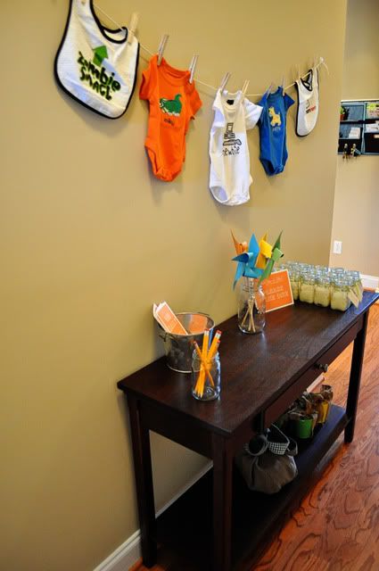
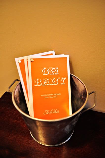
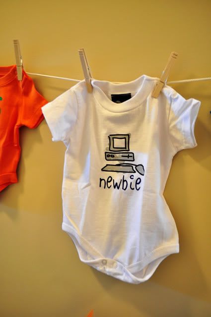
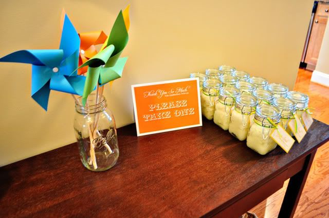
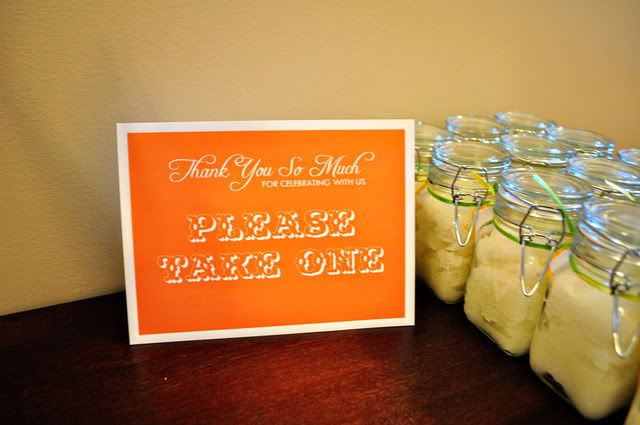
The table in the hallway held the "activities packet," pencils and the shower favors, decorated with pinwheels in a Ball jar and a onesie clothesline.

Photobucket

Photobucket

A nod to the mother and father-to-be's techie backgrounds:

Photobucket

Photobucket

Photobucket

Photobucket

Photobucket

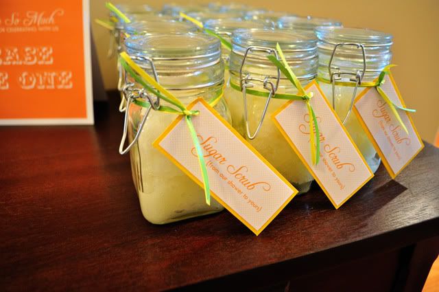
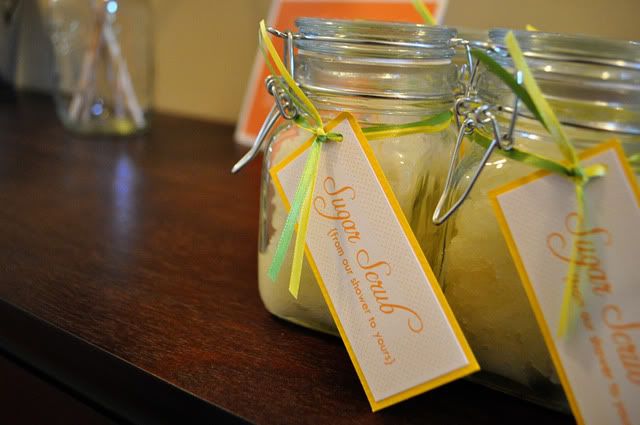
I made homemade sugar scrub for favors, just because I loved the "from our shower to yours" line so much.

Here's the recipe I ended up using: regular granulated sugar, safflower oil (there are lots of different types of carrier oils you can use, like avocado oil, sweet almond oil and vegetable glycerin, but the cheapest solution I found was safflower oil from Whole Foods, found with the cooking oils), and a few drops of essentials oils to make it smell good (I used Sweet Orange and Lemon essential oils, also found at Whole Foods). The canisters were from Michael's. Definitely a nice alternative to the $20 tub of sugar scrub I used to buy from Bath & Body Works in my college days.

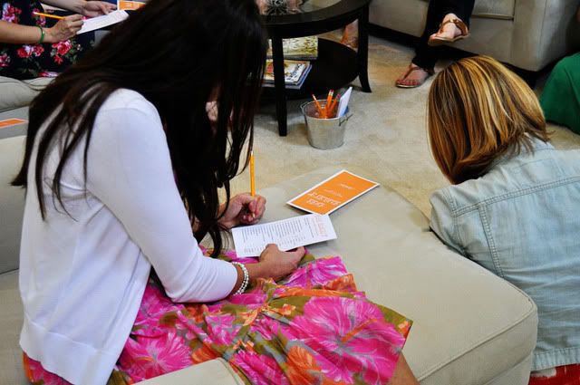
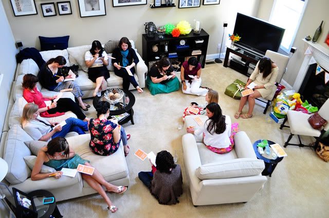
For our activities, I DIY'ed a little packet of games. There were 3 games, each just sort of cobbled together from ideas around the Internets. The first was a celebrity baby name game, where you had to match the baby name with the celebrity parents.

The second was Baby Price is Right. I had gone to Wal-Mart and researched prices of some common baby items, like diapers, formula and baby food. Everyone wrote down what they thought each item cost and totaled up their numbers. Whoever was closest to the total (without going over of course) won.

And game number three was the baby animal game, with a list of adult animals where everyone wrote down the corresponding baby name (cow=calf, kangaroo=joey, for example). It gets pretty hard when you get down to things like swan (cygnet) and turkey (poult).

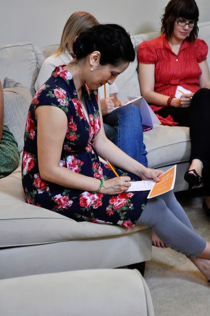
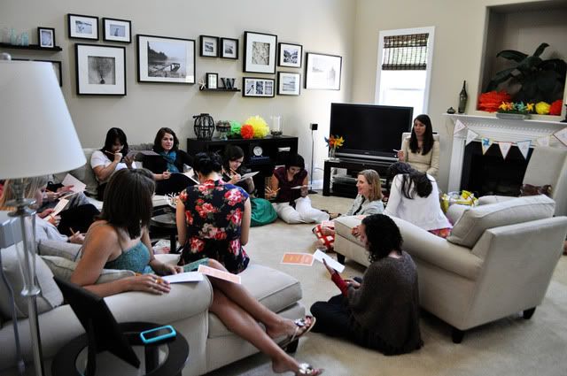
I think everyone had fun working away on their packets.

Photobucket

Photobucket

Photobucket

Photobucket

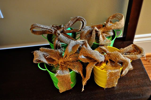
Prizes were kits for growing basil and daisies (from Target), wrapped in strips of tobacco sack.

Photobucket

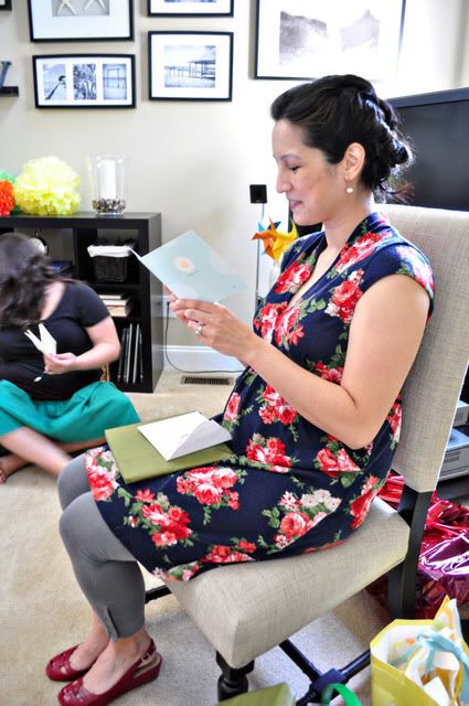
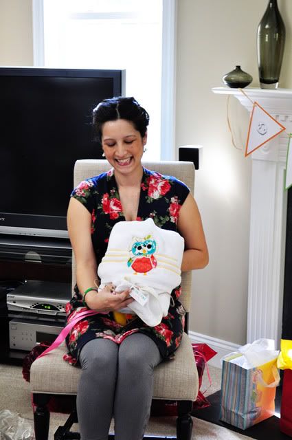
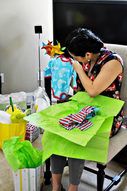
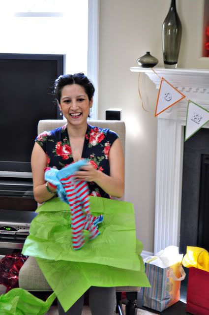
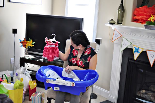
Finally, it was present time.

Photobucket

Photobucket

Photobucket

Photobucket

Photobucket

Photobucket

Photobucket

Isn't she just glowing?!

Baby showers are always fun, and I loved having an excuse to throw a party and have all my coworkers over.

Best wishes Melissa!

Monday, May 23, 2011

Living Room Reveal

I'm finally ready to declare our living room "finished" (even though we all know it never really will be, as I'll constantly be making changes here and there).

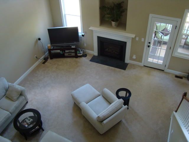
Our living room is huge, both in square feet and height. It's one of the things we liked most about our house when buying it. We knew that one big living room was much more in line with our lifestyle than two smaller living spaces (a formal living room and smaller den/family room that some houses have). And it's a two-story room which makes it feel really open and connected to the loft upstairs.

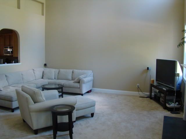
But I had no idea what a challenge it would be to furnish and decorate a room this big. I know, I know, talk about first world problems, huh? Complaining that a room is too big? Anyway, let me show you some befores.

View of the living room looking down from the stairs/loft:

Photobucket

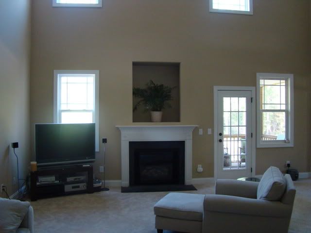
View from the kitchen/hallway:

Photobucket

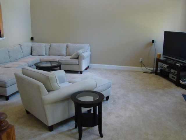
View from our bedroom:

Photobucket

As you can see, our main furniture is already in place in the befores. One of the first things we did after moving in was order the couch (the TV and stand came from Lee's apartment). We knew we needed a sectional to fill the space, but ended up spending hours and hours deciding on the perfect configuration. I fought hard for the chaise lounge on the left side (you can't see it that well in this picture) and it's ended up being the spot on the couch we use 99% of the time (so of course, I was right).

However, going with the chaise option created another challenge -- the coffee table. Because the chaise created a small square area we weren't able to use a regular rectangular coffee table, and most square ones were too big. We finally found a suitable dark wood and glass round one on Target.com and ordered the end tables to match.

For the first 9 months, we had an old Target chair and ottoman in the room, but were finally able to upgrade it. We decided to order the matching chair and ottoman from the same set our sectional came from. Looking back on it now, I wish we'd gone with something different, since it's too matchy-matchy for me now. Ideally, we'd get the Manhattan leather recliner from Pottery Barn, but we've got a lot invested in the current chair and ottoman, so I can't justify making the switch right now.

So as you can see, we had a lot of nice furniture but the room was totally B-O-R-I-N-G with a capital B. And talk about beige. Builder beige walls (with the high ceiling and the room being open to the upstairs and loft, painting was NOT a possibility), beige carpet, beige furniture. It all sort of melted together. Bleh.

But our main source of frustration? This monster of a wall:

Photobucket

This baby is two stories high (I wasn't even able to get a picture of the WHOLE wall) and utterly, completely BLANK. The other three walls of the room all have some sort of architectural interest. Windows, fireplace and door on one, stairs and door to our bedroom on the other, and hallway and cutout window to the kitchen on the third (not to mention these weird little recessed boxes at the top of the wall -- you can sort of see them in the pic above).

But this wall? Nary a visual interruption in sight. What were we going to to with such a big blank canvas? Buying even the biggest piece of art, slapping it on the wall and calling it a day was not going to cut it.

We thought about buying a big tall bookcase to break up the space a bit (and then we could add art/pictures just over the couch portion of the wall). But we couldn't find anything we loved that wouldn't still look dwarfed on that wall. We also thought about buying a big entertainment center to go on the wall and repositioning the couch and chair, but we just couldn't make that configuration work.

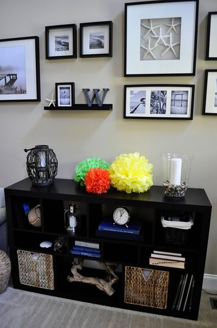
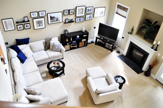
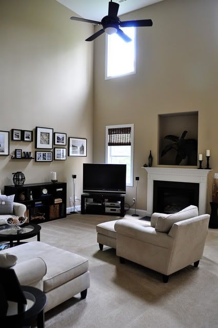
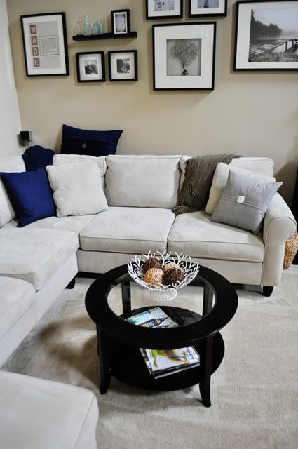
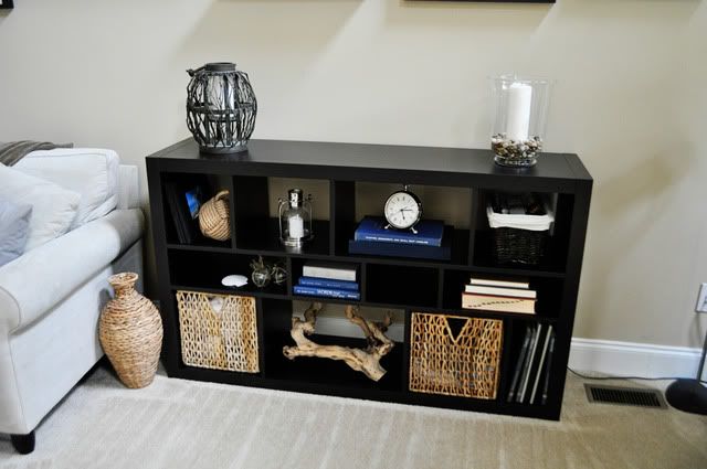
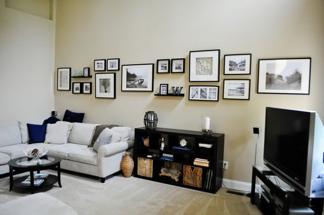
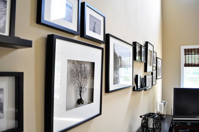
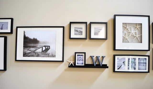
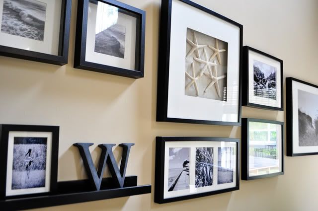
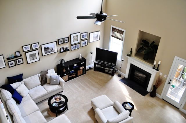
We finally ended up going with a short bookcase to fill the gap between the couch and TV and a gallery wall of frames that stretches across the wall. I also decided on a nautical/beach inspired feel with a navy and gray color palette.

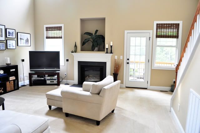
So, now for some afters.

Photobucket

Photobucket

Photobucket

Photobucket

Photobucket

Photobucket

Photobucket

Photobucket

Photobucket

Photobucket

Photobucket

Photobucket

Photobucket

Photobucket

Photobucket

Photobucket

Photobucket

One of the first things I did was add the bamboo shades. Another challenge of this room is that it's not conducive to curtains. On the fireplace wall there are four windows (two wayyy up high and two down low) and the door to the back porch. Because of one of the windows is right next to the door, curtains weren't really an option.

But because we're in the corner lot of a cul-de-sac and our lot backs up to woods, privacy isn't really an issue. No one can see into our living room windows unless they're in OUR yard, which they shouldn't be. So blinds weren't really necessary here but I wanted to add the roman shades to make the room look more homey and finished. I only added them to the ground floor windows, because blinds on windows that high are just weird, right? (Not to mention, how in the world I would have gotten them hung up there?)

Next up was adding the navy and gray pillows and throws to the couch and adding some accessories to the coffee table, end tables and mantle.

Then I took a year-long break while we hemmed and hawed over what to do with that wall. We finally bit the bullet and made a marathon excursion to Ikea for the bookcase and frames.

Cut to another year later for me to actually get pictures in all of the frames and accumulate enough accessories to "style" the bookcase. And that's how we ended up with where we're at today.

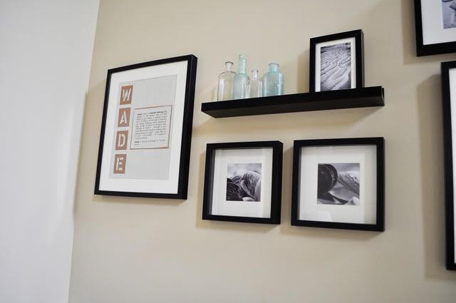
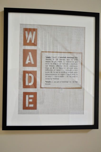
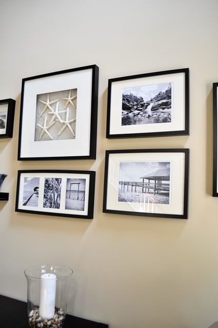
As for the frames, the two large pictures (sand dunes and pond) and the small clam pictures were prints from Ikea. The rest of the images were Sugar-on-the-beach pictures and pics from our Australia trip. Then I matted the square shadow box frames with linen fabric and framed the starfish (from our wedding) and sea fan (purchased on eBay). I knew I wanted to do something with the definition of our last name, since "wade" is an actual word found in the dictionary. So I typed up the definition, printed it straight onto the linen fabric and paired it with stencil letters spelling out Wade.

As always, there's still a list of things I'm not totally happy with:
  • The sad plant in the niche above the fireplace. Obviously that niche was a poor design choice on the part of the builder given the size and shape of TVs these days. WHY are they still putting those things in houses? Anyway, maybe I'll get clever and do something cool there. For now, a plant to fill the space (and pretty poinsettias at Christmas).
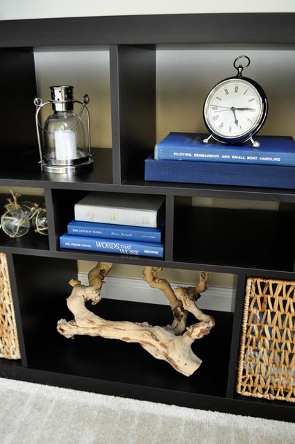
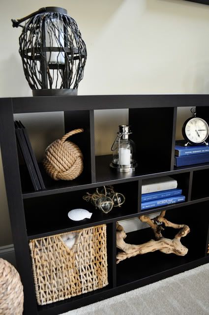
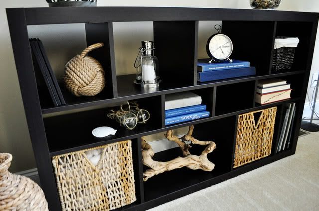
  • The bookcase. Some of the "cubbies" are empty. I'm not totally happy with how it's stylized. But it's the type of thing that will evolve and take time. You can't really set your mind to go out and buy something to fill the space. You need to come across the items and add them over time.
  • I already told you my thoughts on the chair. And my longing for this one.
But for the most part, we love our living room. It's pretty. It's functional. It's us.

Finally, here's a list of sources, if you're interested:
  • Couch, chair and ottoman: Haverty's
  • Coffee and end tables: Target.com
  • Pillows: Pottery Barn, Target and Ikea
  • Throws: Pottery Barn and Ikea
  • Bamboo shades: Overstock.com
  • Vases on mantle: Ikea
  • Candlesticks on mantle: AC Moore
  • Bookcase: Ikea
  • Rustic wood lantern: Homegoods
  • Hurricane vase and pebbles: Ikea
  • Rope knot doorstop: WhateverWorks.com
  • Small silver lantern: Pottery Barn
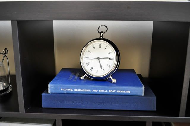
  • Silver pocketwatch clock: Pottery Barn
  • Books: already owned and used book store (I was looking for navy and gray-bound books and was able to find some nautical themed ones as a bonus)
  • Driftwood: Homegoods
  • Baskets: Ikea
  • Glass fisherman's floats: Pottery Barn
  • Frames and shelves: Ikea
  • Vintage glass medicine bottles: flea market
  • Cast metal "W": Restoration Hardware
Related Posts Plugin for WordPress, Blogger...